Calendar An icon of a desk calendar. Cancel An icon of a circle with a diagonal line across. Caret An icon of a block arrow pointing to the right. Email An icon of a paper envelope. Facebook An icon of the Facebook "f" mark. Google An icon of the Google "G" mark. Linked In An icon of the Linked In "in" mark. Logout An icon representing logout. Profile An icon that resembles human head and shoulders. Telephone An icon of a traditional telephone receiver. Tick An icon of a tick mark. Is Public An icon of a human eye and eyelashes. Is Not Public An icon of a human eye and eyelashes with a diagonal line through it. Pause Icon A two-lined pause icon for stopping interactions. Quote Mark A opening quote mark. Quote Mark A closing quote mark. Arrow An icon of an arrow. Folder An icon of a paper folder. Breaking An icon of an exclamation mark on a circular background. Camera An icon of a digital camera. Caret An icon of a caret arrow. Clock An icon of a clock face. Close An icon of the an X shape. Close Icon An icon used to represent where to interact to collapse or dismiss a component Comment An icon of a speech bubble. Comments An icon of a speech bubble, denoting user comments. Comments An icon of a speech bubble, denoting user comments. Ellipsis An icon of 3 horizontal dots. Envelope An icon of a paper envelope. Facebook An icon of a facebook f logo. Camera An icon of a digital camera. Home An icon of a house. Instagram An icon of the Instagram logo. LinkedIn An icon of the LinkedIn logo. Magnifying Glass An icon of a magnifying glass. Search Icon A magnifying glass icon that is used to represent the function of searching. Menu An icon of 3 horizontal lines. Hamburger Menu Icon An icon used to represent a collapsed menu. Next An icon of an arrow pointing to the right. Notice An explanation mark centred inside a circle. Previous An icon of an arrow pointing to the left. Rating An icon of a star. Tag An icon of a tag. Twitter An icon of the Twitter logo. Video Camera An icon of a video camera shape. Speech Bubble Icon A icon displaying a speech bubble WhatsApp An icon of the WhatsApp logo. Information An icon of an information logo. Plus A mathematical 'plus' symbol. Duration An icon indicating Time. Success Tick An icon of a green tick. Success Tick Timeout An icon of a greyed out success tick. Loading Spinner An icon of a loading spinner. Facebook Messenger An icon of the facebook messenger app logo. Facebook An icon of a facebook f logo. Facebook Messenger An icon of the Twitter app logo. LinkedIn An icon of the LinkedIn logo. WhatsApp Messenger An icon of the Whatsapp messenger app logo. Email An icon of an mail envelope. Copy link A decentered black square over a white square.

Architects say public’s views reflected in new Dundee Railway Station design

Post Thumbnail

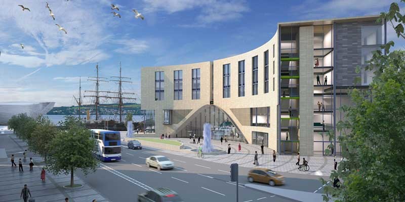
People power has helped to “enhance” the look of Dundee’s planned new £14 million railway station.

The original plan was criticised by West End Community Council, who said it lacked character and was out of keeping with the Victorian buildings round about.

Architects Nicoll Russell of Broughty Ferry carried out a 12-week consultation at which they received many comments from the public most of them supportive.

Now, the windows of the crescent-shaped structure previously likened to a ”banana split” have been grouped in pairs and aligned vertically to give the building a ”bolder” look.

A planning application for the project has now been formally lodged with the city council and is likely to be considered next year.

The five-storey complex, over an archway and featuring ticketing facilities, a hotel, shops and cafe, is to be built before the V&A opens in 2015.

”A smaller number of respondents did make negative comments regarding the station building’s plaza elevation,” the architects admitted in their consultation report.

”The project team have chosen to take these comments on board and therefore to enhance this elevation.

”We believe we have struck a balance which addresses their comments while maintaining the general appearance of the building, which other respondents supported.”

They added: ”We therefore believe the public consultation process has contributed successfully to the revised design of the proposals, which now form the basis of the planning application.”

West End Community Council chairman Andrew McBride likened the original plan unflatteringly to a banana split and questioned the east/west orientation of the building.

He believed a north/south structure would provide a better welcome for visitors in offering views of the Discovery, V&A and river.

The orientation of the design has remained the same, however.

Other factors to do with the building’s relationship with the station square, the archway entrance and the station platform and railway track supported the case to keep the east/west orientation.

The yellow exterior also remains, as Willie Watt of Nicoll Russell explained.

”We want a range of colours that tie in with the range of colours in the centre of Dundee,” he said.

”These range from tanned and bronzed colours to some that are quite dark and melancholy. We have deliberately chosen a colour at the lighter and more cheerful end of that spectrum for the station exterior.”

The £14 million cost will come from Dundee City Council (£8.6 million), a European Regional Development Grant (£2 million) and the Scottish Government (£1 million).

Discussions are taking place with Network Rail for the remainder.
aargo@thecourier.co.uk