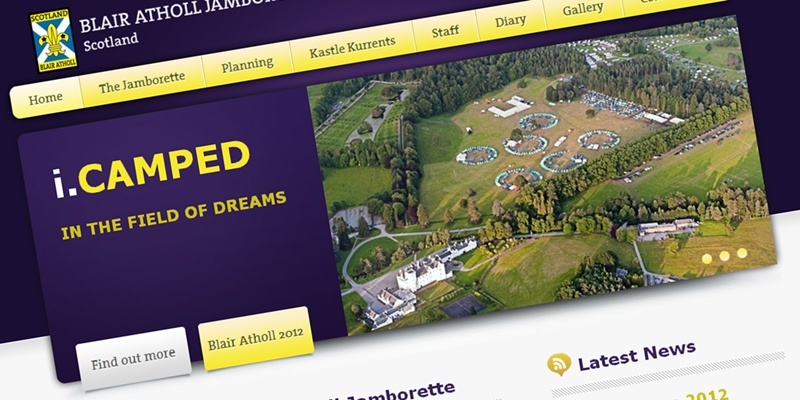
One of the biggest events on the Scouting calendar has finally been given a website worthy of its exciting reputation.
The site for the Blair Atholl International Jamborette was dubbed the ”ugliest” in the UK, beating off competition from 500 other unattractive sources.
Created 10 years ago to promote the global biennial celebrations by Scouts, the website dated quickly as technology advanced.
In a desperate bid to bring it into the 21st century, the volunteers behind the homepage entered the novel competition. Organised by Glasgow-based design firm Easyspace, the competition offered a makeover worth £3,500 for the worst entrant.
Managing director Sarah Haran said: ”We were inundated with entries from some really outdated websites, but the jamborette’s was by far the worst. It looked really old-fashioned, was difficult to navigate and didn’t do the event justice.
”The volunteers who created it did a great job at the time, but Easyspace was able to bring it up to date and build a much more attractive and engaging website.
”With the next camp taking place this July, the brand-new design not only brings it into the 21st century but will also help to attract more Scouts from other countries around the world in the future.”
Gone is the harsh white background and hard-to-read text, replaced with a bright front page giving a glimpse into the fun experienced by the 1,000 young Scouts who flock to Highland Perthshire from 20 different countries.
Scouts Scotland said it is ”very happy” with the new-look website and believes that it now represents the atmosphere enjoyed at the jamborette.
Leader of the Blair Atholl event, Andrew Sharkey, added: ”Even though we were judged the ugliest website in the UK, we were very excited to have won the opportunity of a makeover.
”The new website works really smoothly and is just what we need to publicise our event around the world and grab the attention of young people hoping to take part.”To see the improved website and to find out more about event, go to jamborette.org.uk
