V&A Dundee has been praised by critics after being unveiled to the world’s media for the first time.
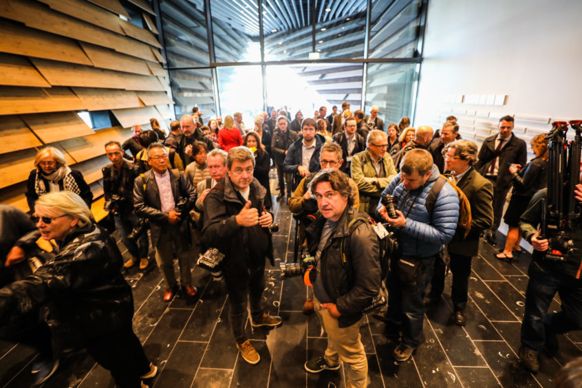
Writers, photographers and bloggers were invited to tour inside the £80 million design museum, which has been more than a decade in the making, early on Wednesday morning.
And the first reviews and reactions to the building, designed by top Japanese architect Kengo Kuma, have been largely positive.
Writers from publications across the UK and wider world have been having their say on the building, which is expected to draw hundreds of thousands of visitors to the city.
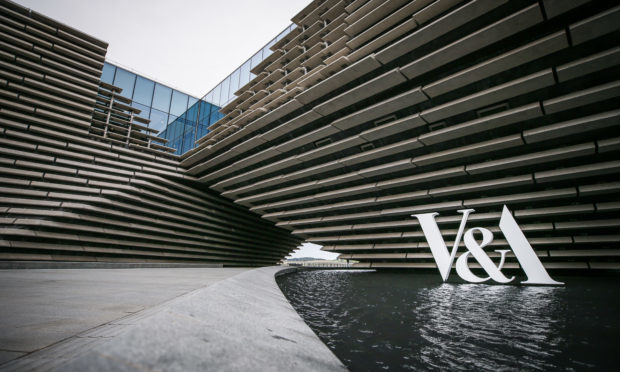
Architecture and design critic Oliver Wainwright’s feature in The Guardian described the striking exterior of V&A Dundee in dramatic detail, writing: “Kuma’s building has a magnetic presence”.
He adds: “It is at once primal and futuristic, its great hull-like forms covered in slabs of gnarled concrete that fragment in places as they rise, as if already ruined.”
Comparing the V&A to the neighbouring RRS Discovery ship, he said they “are a pair of structures alike in their bravery-verging-on-recklessness”.
The Scottish Design Galleries are described in the review as a “tour de force” and he also praises the “dazzling” exhibits on show.
However Wainwright also makes reference to the controversial office block which is under construction across from the V&A, adding: “The view of the museum from Dundee’s Georgian city centre is already partially blocked by the hulking frame of a new hotel and offset by a garish new railway station, both part of a £1bn waterfront masterplan to “connect the city with the river”.”
He concludes: “Thankfully, Kuma’s concrete culture ship is tough enough to withstand whatever the developers want to throw at it.”
The Times’ Jonathan Morrison gave the museum three stars in his review, stating that “there can be little doubt that it has already become a symbol of the city’s much-talked-up renaissance as surely as the Guggenheim in Bilbao drew tourists into that Basque port”.
He adds: “That the new outpost of the quintessentially London brand — the first design museum in Scotland, no less — has already been embraced by taxi drivers, chip-shop customers and SNP ministers, and is fondly referred to as “V & Tay” in honour of the dark river it overhangs, is no less than remarkable considering its history.”
Though taking issue with some aspects of the V&A’s exterior, Morrison says Kuma has designed an “icon” and concludes: “It’s unlikely that the new building will prove anything less than a consummate cultural success.
“As a design, it certainly has its flaws, but it is capable of fascination, is unique and, perhaps most importantly, the people of Dundee seem to love it.”
Ellis Woodman, The Telegraph’s architecture critic, was more harsh on the building Kuma has described as his greatest achievement – voicing “frustrations” at some aspects of the design.
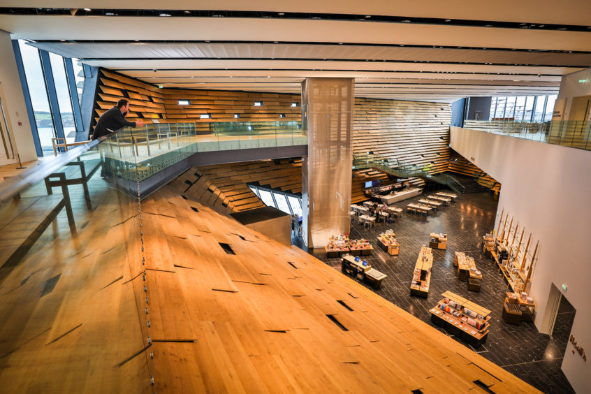
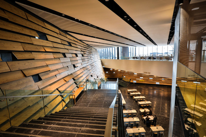
In his three-star review he said: “Positioned hard against the riverbank, the building comprises two twisting volumes that rise independently before conjoining in midair.
“Kuma likens the effect to a gateway between the city and the Tay, but the impression his building makes is ultimately as much organic as architectural.”
On the V&A’s exhibits, he writes: “If it can maintain that level of quality, the museum should be well on track to drawing the 350,000 annual visitors that it is aiming to attract.”
He describes the building as a “cause for celebration” but adds that the office and hotel developments of the waterfront are lacking “architectural ambition”.
Duncan Macmillan, an art critic at The Scotsman, also reviewed the building, describing it as “fittingly spectacular” – though he preferred the interiors to its exterior design.
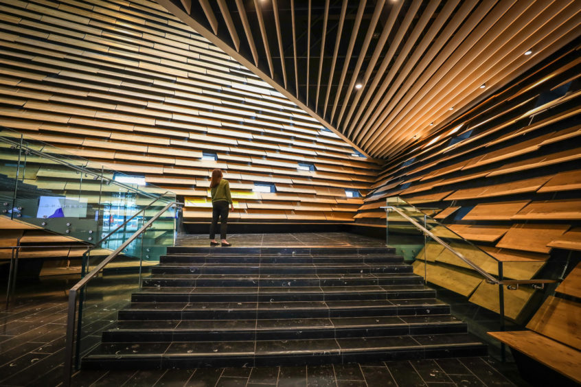
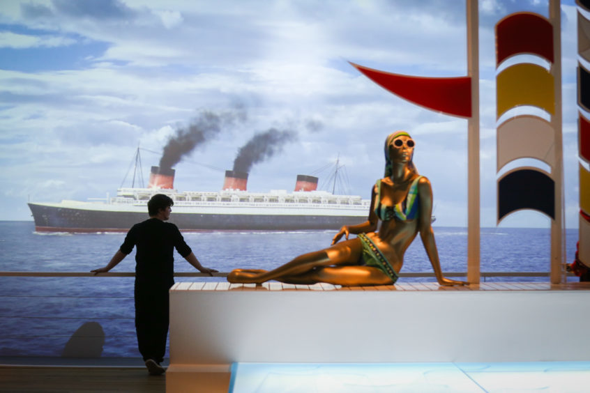
He says the Scottish Design Galleries exhibit “is also where the museum’s V&A title becomes reality” with the Ocean Liners display described as “a fittingly ambitious beginning”.
Meanwhile, excitement is reaching fever-pitch on Twitter, with many expressing their anticipation at visiting the V&A for the first time.
So excited about this ✨ ✨ ✨ #VADundee https://t.co/wh6ivIDDbP
— Elizabeth Pilley (@Lizzie_pilley) September 12, 2018
So excited to see this at the weekend! ⭐️ #vadundee https://t.co/w3dIzjDFyi
— Laura Ironside (@LauraIronside) September 12, 2018
Cannot ?? wait ?? to ?? visit ?? #vadundee #culturevulture #howbonnieisthisbuilding https://t.co/BWFlFeldIv
— Chaz Fraz (@chaz_fraz) September 12, 2018
Lots of excitement in Dundee at the new V&A. People saying there’s renewed hope and optimism in the city.
Just don’t mention Dundee United. I mentioned them once but I think I got away with it.— Peter A Smith (@PeterAdamSmith) September 12, 2018
Kengo Kuma’s Fantastic looking V&A building in Dundee. I will certainly visit when there. https://t.co/z2u2ZDjZrh
— Iain McEwan (@iain_57) September 12, 2018
Very excited about the @V_and_A #dundee
— nickede (@nickede) September 12, 2018
Great day and week for my home town with the amazing V&A opening! Dundee is on the up ⬆️ ? https://t.co/WvAUc1Sv1x
— Andy Nicol (@AndyNic9) September 12, 2018
The Dundee regeneration – the V&A, Minecraft and Grand Theft Auto , a new wave of creativity and a billion pound transformation of its waterfront pic.twitter.com/ztUe1U8c9U
— alex thomson (@alextomo) September 12, 2018
Scotland’s Bilbao? V and A Dundee looking great this morning…. pic.twitter.com/b1CFmPwypo
— James Runcie (@james_runcie) September 12, 2018
The Ocean Liners exhibition @VADundee is full of wonders from the romantic age of sea travel. Set sail for Dundee to see it as soon as you can. #Dundee #VADundee #design pic.twitter.com/yIBf715Ne5
— Living Magazine (@LivingMagGroup) September 12, 2018
First look inside Kengo Kuma's V&A Dundee!!! https://t.co/6NxFh5PGSI pic.twitter.com/Xu5Reypaag
— Architects’ Journal (@ArchitectsJrnal) September 12, 2018
First glimpse of V&A Dundee this morning at the press launch – featuring our beautiful Mackintosh Oak Room interior. Philip Long, Director of @VADundee said ".. the object I am most proud of in the interior of the museum is the restored Oak Room…" https://t.co/qOR8LARxbj pic.twitter.com/Kl03yFhYUT
— Kelvingrove (@KelvingroveArt) September 12, 2018
‘An ace caff with quite a nice museum attached’ is NOT the V&A Dundee’s ad campaign. pic.twitter.com/23WCiMLvWN
— Will Gompertz (@WillGompertzBBC) September 12, 2018
Planning your visit to @VADundee when it opens on 15 Sep? #ArtQuarterly magazine has all the tips you need on making the most of cultural #Dundee: https://t.co/z1raGvN6qu pic.twitter.com/BGtHCv97w3
— Art Fund (@artfund) September 5, 2018
