With a public consultation on whether regulations around the information on food products should be tightened, we look at what we can learn from the labels.
Food labelling has come a long way since the days consumers would be blissfully unaware as to the calorific, fat, salt or sugar content of the products they were buying.
Yet, the issue is back in the spotlight today after a government-ordered review criticised some firms for routinely omitting information about ingredients with high levels of sugar and starch.
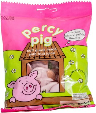
Following The National Food Strategy review, led by Leon restaurant founder Henry Dimbleby, Percy Pig sweets stole the headlines with Marks & Spencer in particular being criticised over the wording on its packaging. The “made with fruit juice” description was condemned as “genuinely misleading”, with the first four ingredients on the back of the packet listing different forms of sugar.
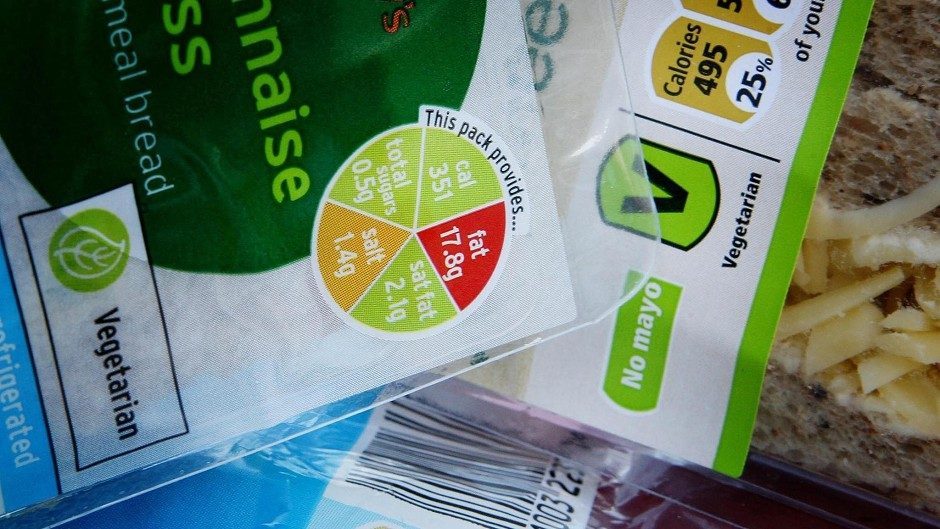
In 2013, a new front-of-pack nutrition labelling scheme was launched in the UK to help consumers see at a glance what is in their food. The label is colour-coded red, amber and green, and highlights “percentage reference intakes” (guideline daily amounts), to show how much fat, saturated fat, salt, sugar and energy is in a product.
- Red means the product is high in one of these factors and shouldn’t be eaten often.
- Amber means medium, and if a food contains mostly amber it can be eaten in moderation.
- Green means low, and the more green lights a label displays the healthier the choice.
But should the government go further on food packaging? A recent report on public attitudes from think-tank Demos, suggests there are too many barriers to healthy eating in the UK.
It suggests packaging of foods that are high in fat, sugar and salt, should be modelled on the packaging changes made to tobacco goods, which have been standardised and carry health warnings to make them them less appealing. The study found almost half (45 percent) of people surveyed would support this kind of packaging on unhealthy foods.
Now Food Standards Scotland is seeking feedback from consumers, health professionals and the food and drink industry as part of a UK-wide consultation on front of pack nutrition labelling (FOPNL).
Senior policy advisor at Food Standards Scotland, Sam McKeown, said: “FOPNL plays an important role in reducing obesity, as it helps us understand the nutritional content of the products we’re buying clearly and efficiently.
“It’s been seven years since the UK recommended the multiple traffic light front of pack label. Since then, countries around the world have created new forms of FOPNL and there is a growing evidence base.
“The way we shop for and purchase food has changed, with online food shopping and delivery being one of the fastest growing sectors in the UK grocery market. Therefore, it’s a good time to consult to ensure that we’re appropriately informed to continue to support consumers to make healthier decisions.”
Faced with spiralling levels of obesity, two years ago the Chilean government imposed a range of restrictions around how food is marketed and labelled, including a system that requires packaging to prominently display black warning signs on items high in sugar, salt, calories or saturated fat – something we could see here in the coming years, subject to the outcome of the review.
Stephen Hendry, senior policy advisor, food labelling and standards, at Food Standards Scotland, says the objective for any future labelling changes is to make Scottish consumers “confident in their food choices, and make it as easy as possible for them to know what is in their food”.
He added: “Consumers should be able to easily choose or buy a product according to their particular requirements, be it for diet or health, personal tastes and preferences.
“The UK Government and Devolved Administrations, including Food Standards Scotland, recently launched a consultation to help inform any future improvements to front-of-pack nutrition labelling (FOPNL). The consultation aims to support consumers to better understand the nutrient content of their food and drinks, and make healthier choices for themselves and their families.”
With the UK-wide consultation under way, when Britain leaves the EU at the end of the year, the aim will be to build on existing labelling recommendations.
Stephen added: “General food labelling – name of the food, ingredients lists, allergens etc – and nutrition information requirements are regulated at EU level. The EU Food Information to Consumers Regulation sets out the requirements, including, for most prepacked foods, the mandatory nutrition declaration which is often found on the back or side of packaging. It also requires that food information must not be misleading and be accurate, clear and easy to understand for the consumer.
“Whilst recommended, FOPNL is not mandatory and is provided by food businesses on a voluntary basis. As the EU transition period ends on December 31, the UK Government and Devolved Administrations will seek to build on the success of FOPNL in the UK to improve the current scheme.”
What to watch out for on food labels – and what’s missing

Dr Simon Steenson, nutrition scientist at the British Nutrition Foundation (BNF), says that while labelling on packaging can be confusing, there are some key things we should look out for…
Sugar
With some products declaring “no added sugar” on their packages, it’s easy to then assume that this is an unsweetened product when, in fact, it often indicates that sugar substitutes have been used instead.
In the Netherlands, food producers were ordered to remove that wording from packages after it was deemed misleading by the nation’s food industry watchdog.
Dr Simon Steenson said: “Food labels provide information on the amount of total sugars present in a food or drink, which is usually given in the information on the carbohydrate content as ‘of which sugars’. This includes both the sugars naturally present in whole fruit and milk, which are less of a concern from a health perspective, as well as what are called ‘free sugars’, which are those added by the manufacturer, or are naturally present in honey, syrups and unsweetened fruit juices, and which we are recommended to limit our intake of to no more than 5% of our daily energy intake, or about 30g of sugar – equivalent to around 7 sugar cubes for an adult.
“This can be confusing, but by comparing the information on the total sugar content with the ingredients list it should be possible to tell if a product contains a lot of free sugars.
“For example, foods or drinks where ingredients such as ‘sugar’ or ‘glucose-fructose syrup’ are one of the first few ingredients are likely to contain a lot of free sugars. On the other hand, a plain yogurt may state it contains 9.9g of total sugars, but none of these are free sugars, as they all come naturally from the milk. It is a good idea to limit fruit and vegetable juices, and smoothies to a small glass per day (150 ml), as these can be high in free sugars and also acids that can damage teeth.”
Fibre
Dr Simon Steenson says: “While the voluntary traffic light labelling on the front of packs tell us about which nutrients we should be limiting, including energy, saturated fat and salt, it doesn’t tell us about those we should be aiming for more of.
“Fibre is important for maintaining our gut health and can reduce the risk of diseases such as heart disease and cancer, but many of us don’t eat the recommended 30g per day. You can check the fibre content of foods on the back of the packet. Choosing higher-fibre foods such as brown pasta, rice and bread, as well as canned pulses, can be a good way to increase the amount of fibre in your diet.”
Fat
“When it comes to fat, it’s important to remember that foods which carry claims such as ‘reduced fat’ describe the amount relative to a similar product, and may still be quite high in fat, and so contain a lot of calories per portion. It’s also worth looking at what proportion of the fat in a product is saturated fat, which can increase the risk of heart disease.”
Portions
“One final area that many of us may not think about is portion sizes, but this can make it easier to eat more calories than we need. Try to measure out portions when cooking or preparing foods, such as two handfuls of dried pasta shapes or rice, or a piece of cheese the size of two thumbs together. The British Nutrition Foundation has produced a guide to portion sizes that is available free to download from our website at www.nutrition.org.uk.”


