Calendar An icon of a desk calendar. Cancel An icon of a circle with a diagonal line across. Caret An icon of a block arrow pointing to the right. Email An icon of a paper envelope. Facebook An icon of the Facebook "f" mark. Google An icon of the Google "G" mark. Linked In An icon of the Linked In "in" mark. Logout An icon representing logout. Profile An icon that resembles human head and shoulders. Telephone An icon of a traditional telephone receiver. Tick An icon of a tick mark. Is Public An icon of a human eye and eyelashes. Is Not Public An icon of a human eye and eyelashes with a diagonal line through it. Pause Icon A two-lined pause icon for stopping interactions. Quote Mark A opening quote mark. Quote Mark A closing quote mark. Arrow An icon of an arrow. Folder An icon of a paper folder. Breaking An icon of an exclamation mark on a circular background. Camera An icon of a digital camera. Caret An icon of a caret arrow. Clock An icon of a clock face. Close An icon of the an X shape. Close Icon An icon used to represent where to interact to collapse or dismiss a component Comment An icon of a speech bubble. Comments An icon of a speech bubble, denoting user comments. Comments An icon of a speech bubble, denoting user comments. Ellipsis An icon of 3 horizontal dots. Envelope An icon of a paper envelope. Facebook An icon of a facebook f logo. Camera An icon of a digital camera. Home An icon of a house. Instagram An icon of the Instagram logo. LinkedIn An icon of the LinkedIn logo. Magnifying Glass An icon of a magnifying glass. Search Icon A magnifying glass icon that is used to represent the function of searching. Menu An icon of 3 horizontal lines. Hamburger Menu Icon An icon used to represent a collapsed menu. Next An icon of an arrow pointing to the right. Notice An explanation mark centred inside a circle. Previous An icon of an arrow pointing to the left. Rating An icon of a star. Tag An icon of a tag. Twitter An icon of the Twitter logo. Video Camera An icon of a video camera shape. Speech Bubble Icon A icon displaying a speech bubble WhatsApp An icon of the WhatsApp logo. Information An icon of an information logo. Plus A mathematical 'plus' symbol. Duration An icon indicating Time. Success Tick An icon of a green tick. Success Tick Timeout An icon of a greyed out success tick. Loading Spinner An icon of a loading spinner. Facebook Messenger An icon of the facebook messenger app logo. Facebook An icon of a facebook f logo. Facebook Messenger An icon of the Twitter app logo. LinkedIn An icon of the LinkedIn logo. WhatsApp Messenger An icon of the Whatsapp messenger app logo. Email An icon of an mail envelope. Copy link A decentered black square over a white square.

Dundee chocolate expert says Toblerone customers will feel “conned” over shape change

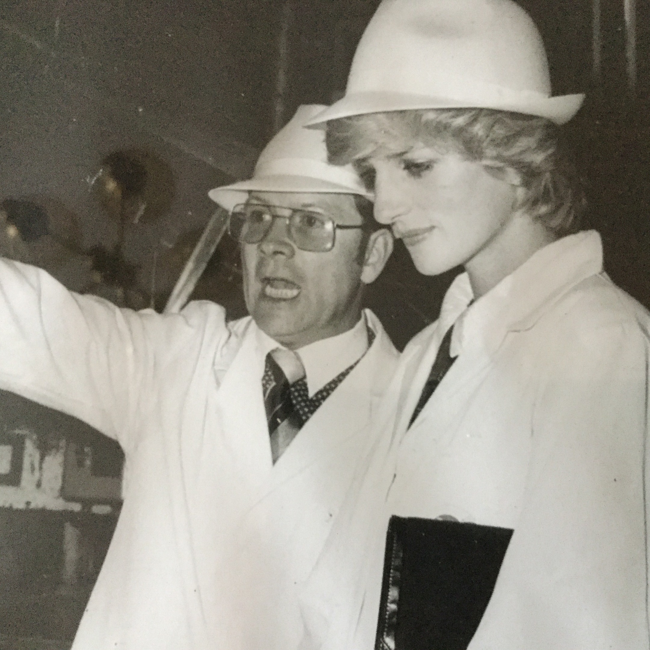
Princess Diana with Derek Shaw on a visit to Keiller Factory in 1983

A Dundee chocolate expert has claimed fans of Toblerone will feel “conned” over the decision to alter the shape of its iconic triangle.

The maker of the 108-year-old chocolate bar has changed its distinctive mountain peak shape and made bars lighter because of rising ingredient costs.

Versions of the famous Swiss treat have lost almost 10% in weight and now have longer gaps between the previously tight-knit chocolate “Alps” although the packaging has stayed the same.

Derek Shaw, who was previously work director of Dundee’s Keillor Factory, which produced Toblerones, said he didn’t understand the decision.

Derek said: “People are going to feel conned.

“I have been in this business for 50-plus years and I really think that customers are going to feel like they are being taken for granted.

“I’m sure the company have had loads of meetings and discussions about the decision but I just find it really, really strange.

“It’s disappointing because they would have been better off taking a couple of blocks off the end and keeping the distinctive triangle that people know Toblerone for.”

Mr Shaw, who is now a confectionery consultant and still based in Dundee, said that though all companies are looking at what they can do to save money, it has to be done in the right way.

“The supermarkets have been squeezed and in turn they have been squeezing the manufacturers,” he said.

“This means costs are going up and all companies are conscious of that but I don’t really understand this decision.

“It could actually happen that there is so much outrage that they just change it back, we’ll see.”

Fans of the popular treat have been venting their fury, with some claiming they will not buy the product ever again.

Tayport resident, James Donaldson, 69, said: “It’s rubbish and it’s just such a rip off.

“I honestly wouldn’t buy it now because of the change. It’s like crisps, when you open them, the pack is full of air.”

Social media was also ablaze with disgruntled sweet-toothed consumers with one describing the new look as a “toothless comb”.

The change means the 400g bars have fallen to 360g and the 170g bars to 150g.

The company which produces Toblerone, US based Mondelez, also owner of Cadbury, has faced criticism in recent years for tinkering with famous products such as Dairy Milk bars and Creme Eggs.

Toblerone said in a Facebook statement: “Like many other companies, we are experiencing higher costs for numerous ingredients.

“We carry these costs for as long as possible, but to ensure Toblerone remains on-shelf, is affordable and retains the triangular shape, we have had to reduce the weight of just two of our bars in the UK, from the wider range of available Toblerone products.”