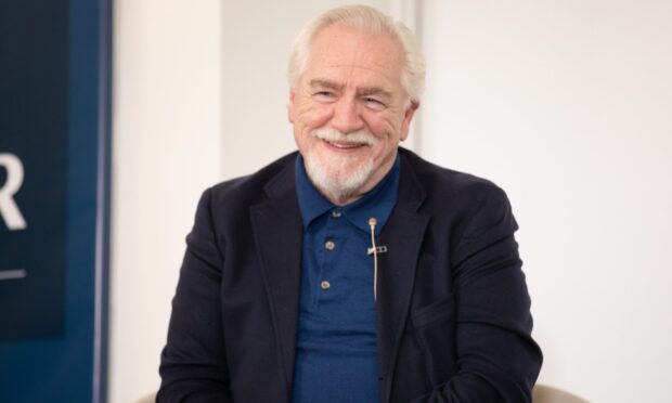
The Courier’s chief reporter in Dundee, Stefan Morkis, was one of the first journalists to be invited to view inside V&A Dundee. With photos by Kris Miller, this is his take on the building on which so many of the city’s hopes are pinned.
Should a building be funny?
Because, make no mistake about it, Kengo Kuma’s “living room for the city” is very funny indeed.
It turns itself inside out, plays with your perceptions, disorientates and dazzles. It makes you laugh at the audacity of the design and Kengo Kuma’s genius at dreaming it up in the first place.
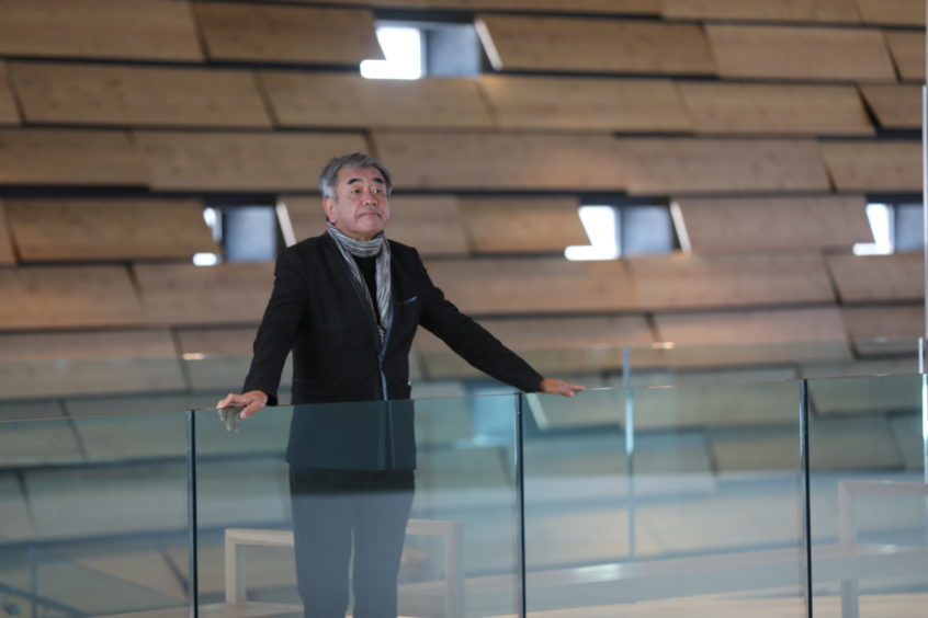
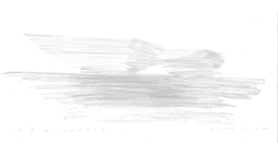
If you visit his website you can see the Japanese architect’s initial sketch for the museum. The leap from that pencil scribble to the completed museum – designed both inside and out by Mr Kuma – is staggering.
Everything that was promised about the V&A – how it would reconnect Dundee with the Tay, provide a space for the public and be unique – has been fulfilled and then some.
The exterior of the V&A is, from a distance, familiar to us all. Up close, it’s even more impressive.
It is possible to see how every single one of the near 2,500 concrete panels differs. Again, the sheer chutzpah of the design takes your breath away.
Walking around, and under, the V&A is an adventure in itself. The closest comparison I can make for a piece of public architecture is Sir Anish Kapoor’s Cloud Gate in Chicago, something that shifts and changes as you move.
The big difference, of course, is that the V&A has another world of delights waiting inside.
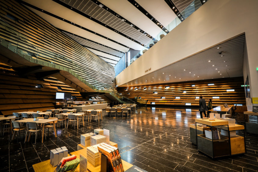
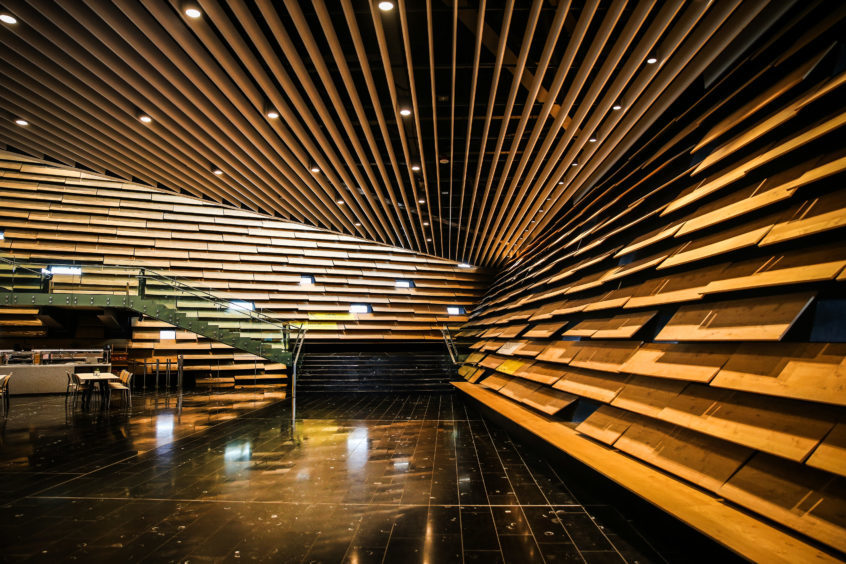
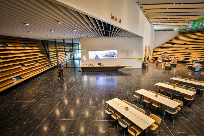
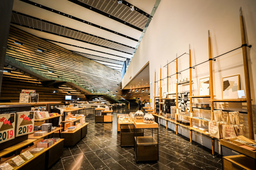
Whereas the outside is, as promised, reminiscent of craggy cliffs, the first thing that strikes you when crossing the threshold into the building is how spacious, light and warm it feels.
The wood panelled walls are an almost direct inversion of the exterior while the floor, made from Irish limestone, contains thousands of fossilised remains – a reminder the natural world that inspired Mr Kuma is never far away.
Famously, the V&A has no straight exterior walls and the museum continues to twist and turn as you walk through the interior of the building, taking you up from the entrance – almost hidden at the far end of the building – into the main reception area then up the grand staircase to the vast exhibition spaces.
From here you can look back down on the main reception area, the vertigo-inducing vantage point sloping away from you like cliffs.
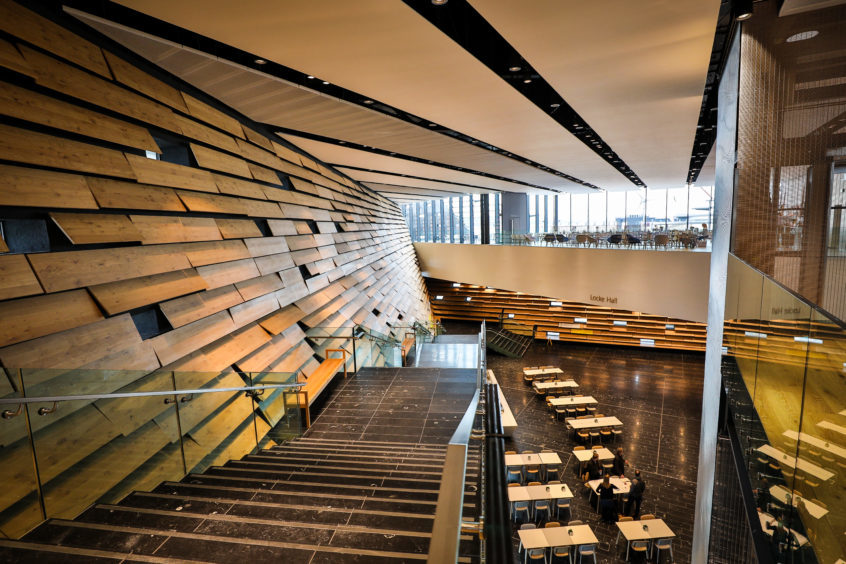
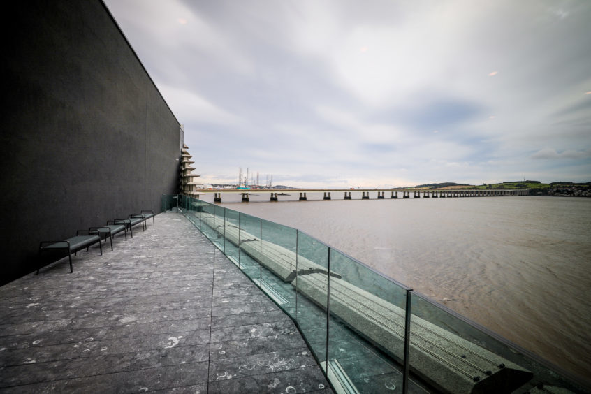
On the ground floor, full-length windows allow you to peer on to the banks of the Tay beneath your feet, while upstairs there are even finer views of the river, both east and west. As winter shortens the days to within the museum’s opening hours, it will be a sought after spot to watch the sun rise and set.
At times, it feels like you’re standing on the prow of a ship.
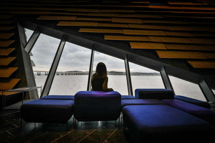
Only then do you realise what an amazing fit for the waterfront – and for Dundee’s maritime history – the museum really is. It appears to have evolved rather than been designed.
When plans for the V&A at Dundee were first put forward the city was promised an iconic building and that is exactly what has been delivered.
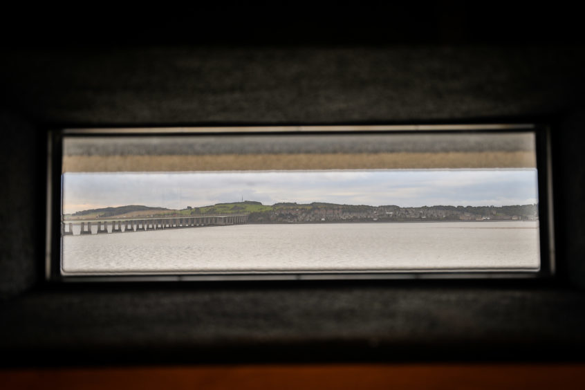
The museum – all £80 million of it – is unique and it belongs to the people of Dundee, every individually cast concrete block of it.
But it’s not just Dundonians who are going to take this building to their hearts; visitors from across Scotland and the world will do so too.
Frank Zappa famously once said that writing about music was like dancing about architecture. But if you visit the V&A and feel like doing a little jig at the sheer, giddy joy of it all, I’m sure no one would blame you.
