History is full of what-ifs, near misses and woulda coulda shouldas but, ultimately, it’s a tale written by the winner.
Tom Selleck should’ve been Indiana Jones.
Amerigo Vespucci should’ve got the credit for realising the New World was, in fact, a new continent.
But it’s Harrison Ford we love and Christopher Columbus we know.
Second place, it would seem, is just first loser.
Dundee was the winner, though, when it was announced that a V&A Museum would be coming to the city by the Tay.
And V&A Dundee would have looked very different if these forgotten blueprints had been selected during the global contest to determine its design.
Visions for museum on River Tay…
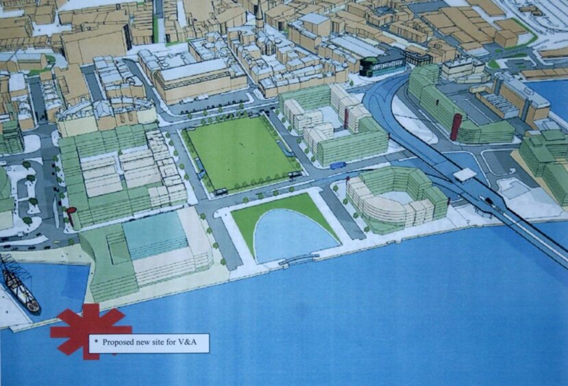
The competition was launched in January 2010, seeking an architect to design an iconic building at Dundee waterfront “which would form a promontory out into the Tay”.
More than 120 designs were submitted for the planned museum.
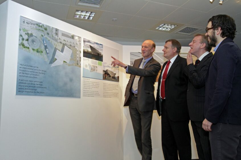
These were narrowed down to a shortlist of six which were put on display at Abertay University.
The half-dozen firms were responsible for some of the world’s most iconic buildings, including the Porsche Museum in Stuttgart and the 9/11 Memorial & Museum in New York City.
The standard of entries was high.
More than 13,000 people visited Abertay over five weeks to give their take on the plans, before the eventual winner was announced in November by the V&A steering group.
Japanese architect Kengo Kuma won the competition with his design, which was inspired by “light, nature and traditional building techniques”.
The rejected entries were consigned to the dustbin of architectural history.
Until now.
So did the judging panel back the right horse?
And what might have happened if the dice had fallen differently?
New York
The REX entry was big and bold.
The design team was based in New York and their works in progress in 2010 included Museum Plaza in Kentucky and the Central Library and Music Conservatory in Kortrijk, Belgium.
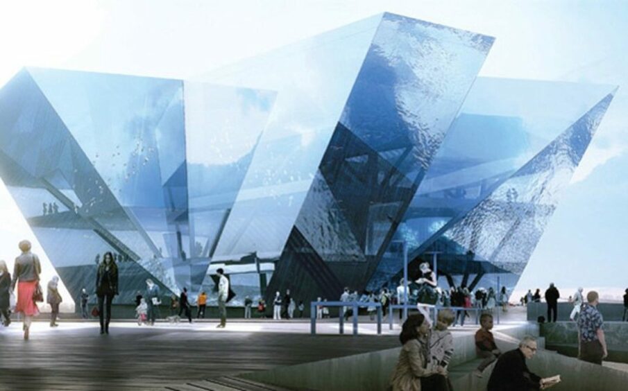
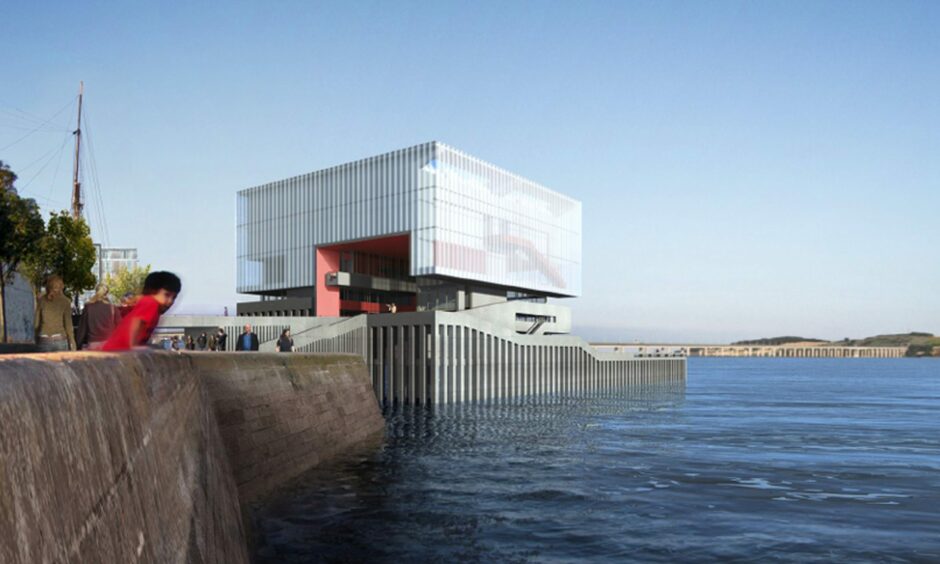
Looking like a giant crystal, the “bluebell” design for the V&A was an angular glass mass right on the waterfront.
The architects placed flexibility at the heart of the design.
They said: “Despite an increased need to accommodate change, contemporary design still relies on an antiquated version of flexibility — one size fits all.”
Norway
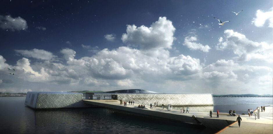
Sea views would have to been the fore with this entry.
Norwegian architect firm Snohetta was established in 1989 and its work included the Norwegian National Opera and the pavilion at the 9/11 Memorial & Museum.
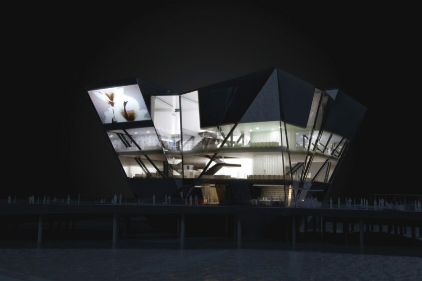
The Dundee V&A design was a “low-lying shimmering structure that literally floats on the Tay, harnessing the flow of the river to power the building”.
Snohetta said: “Our museum is designed to engage with the light of the river, the dynamic of the river and with the energy of the river.
“Our design seeks to exploit and heighten the experience of this unique river setting by creating a direct relationship between the ‘building’ and the movement, flow and surface of the water as it changes throughout the course of the day.”
Washington
Next up was a White House direct from Washington.
Architect Steven Holl was named as America’s best by Time magazine.
High-profile commissions included the Kiasma Museum of Contemporary Art in Helsinki, Finland, the University of Iowa’s School of Art, Seattle University’s Chapel of St Ignatius and Nelson Atkins Museum of Art in Kansas City.
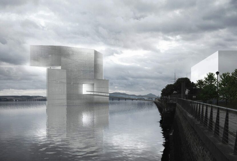
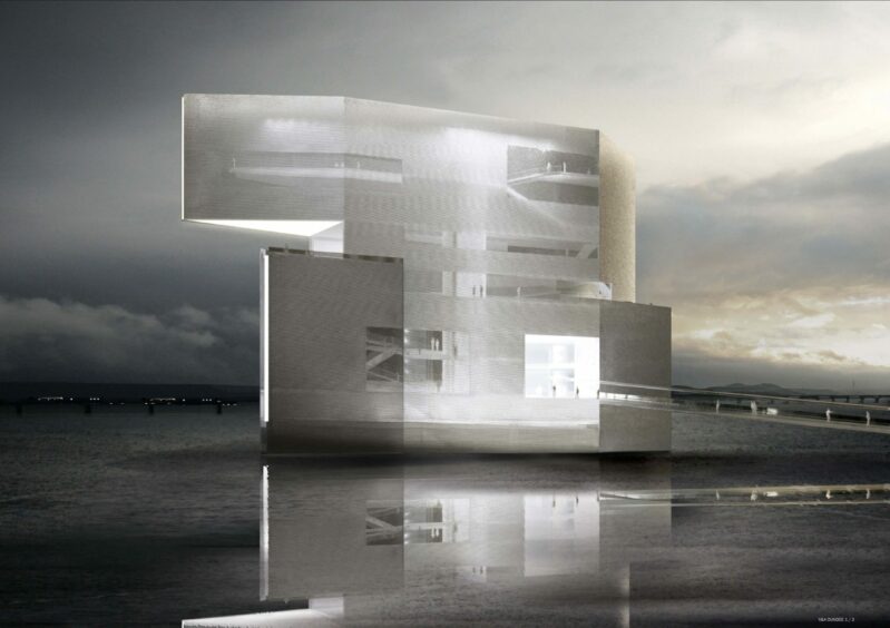
Washington-based Holl’s vision for the V&A at Dundee came from the contrasting words “heavy and light”.
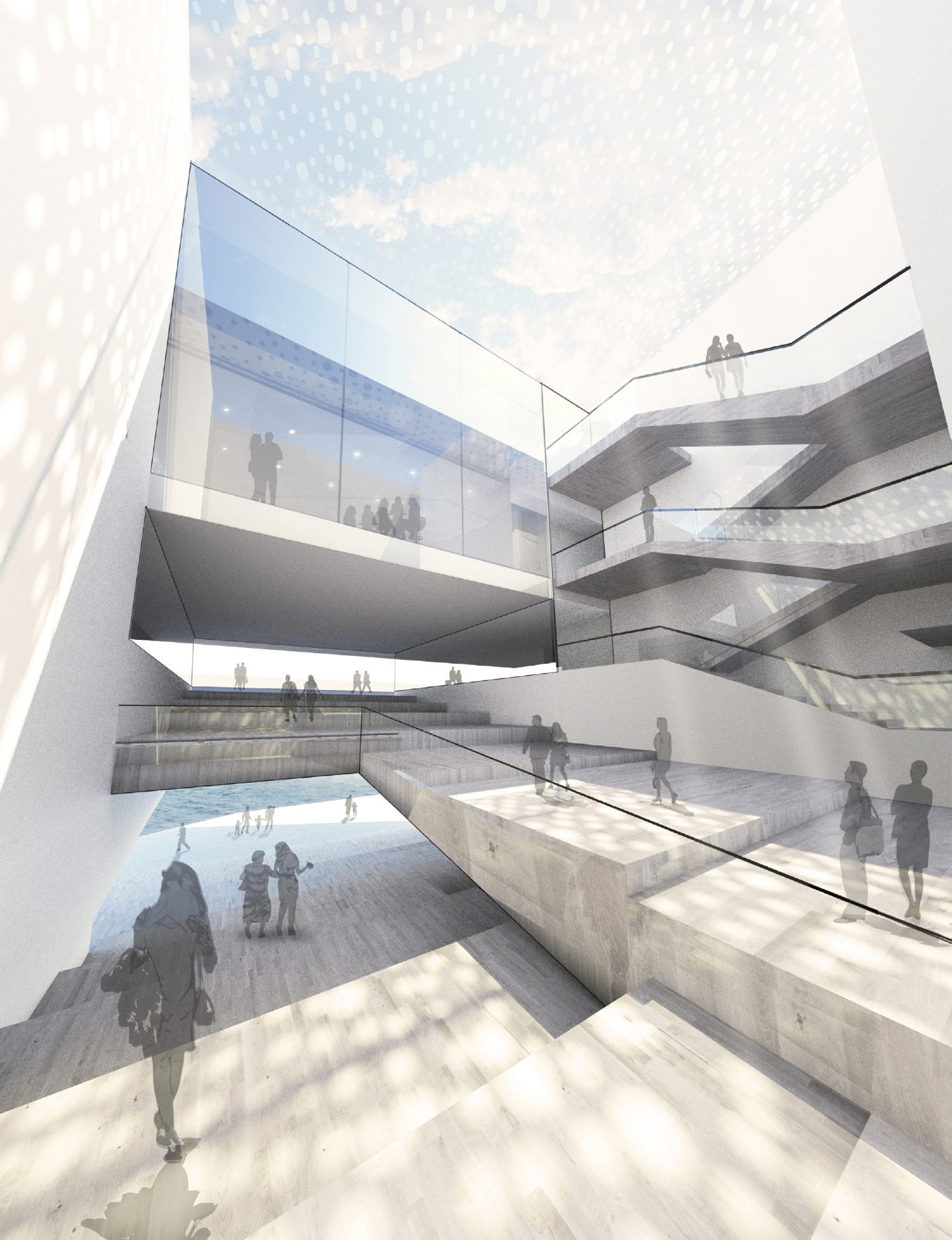
He stated: “Floating over its own reflection in the River Tay, the new form levitates alive and is fused with the changes in the river water and weather.
“Inner spaces around a cascade of light are promising like a blank page about futures to be creatively fabricated.”
Scotland
Edinburgh-based Sutherland Hussey Architects was the only UK entry.
Its work included embassies, hotels, museums, factories, commercial developments and residential work.
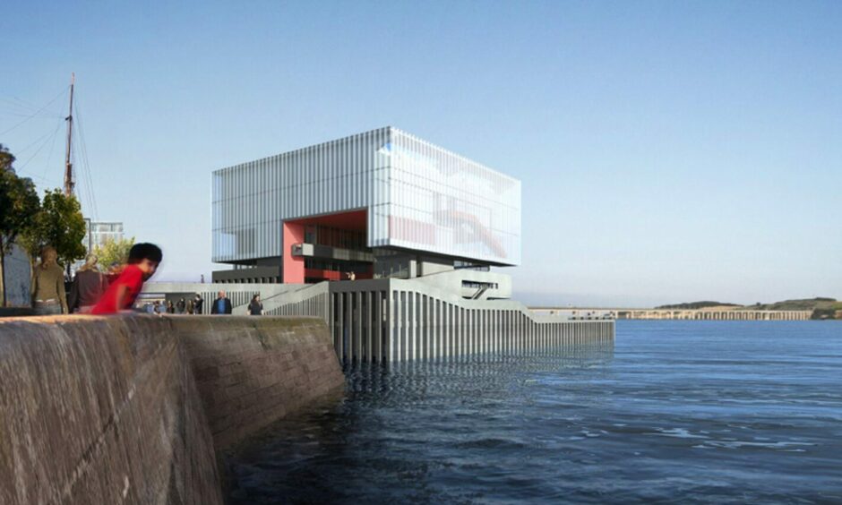
Its V&A design harked back to one of the oldest Scottish structures — the crannog — and jutted out into the Tay.
The firm said: “The design proposal locates the museum as a ‘Crannog’ — literally an artificial island sitting in the water.”
The “clear, simple form”, would be connected back to the mainland by a large ramped bridge.
Austria
The Austrian entry was certainly eye-catching.
Delugan Meissl Associated Architects past projects included the Porsche Museum in Stuttgart, the Filmmuseum in Amsterdam and the Cultural Centre of Jordan.
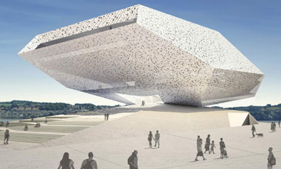
The company’s inspiration for the Dundee waterside project was drawn directly from the surrounding landscape, with the angular, boulder-like building reflecting the hills.
The Delugan Meissl team described the design as “a soft, gentle rise that forms from the artificially-created grounds of the new structure’s topographical foundation before it
transitions counter-inclined into the bordering shoreline”.
They said: “At this location the museum forms a topographical and structural continuation of the waterfront landscape between the urban fabric and the Firth of Tay.”
The winning design for V&A Dundee – almost…
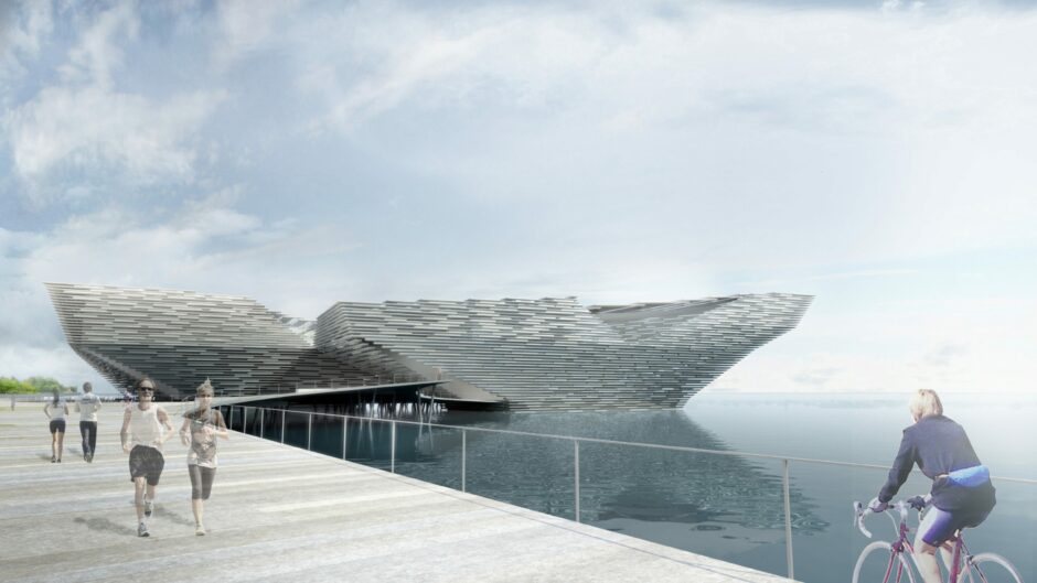
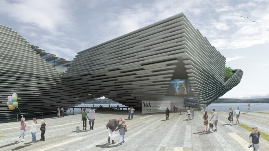
Kengo Kuma‘s inspiration for the V&A was said to use “light and nature and traditional building techniques, reinterpreting them for the 21st Century”.
He said: “The museum itself with its big and open public hall will be part of the new system of public spaces, becoming a sort of covered public square where people can go and enjoy the warm feeling of this welcoming space, just for shopping at the museum store, or for going to dinner at the restaurant or to have a drink at the café.”
Kuma’s vision was described as “bold and ambitious, but buildable and practical” and was to extend out from the site into the River Tay, to give the appearance of the museum “floating on water”.
The Kuma building was the unanimous choice of the judging panel, despite the American REX design receiving huge support during the public consultation process.
Steven Holl and Sutherland Hussey’s designs were the least popular with Dundonians.
Were they right?
Panel chairwoman Lesley Knox said: “We were delighted by the quality of all the designs which were submitted to the competition and I think this is reflected in the huge public interest which our exhibition of models has generated.
“Kengo Kuma’s proposal is a worthy winner — a building that will delight visitors and encourage them to revisit it again and again.”
Kuma said the building would be delivered with “vigour and passion”.
Eventually.
In a bid to keep their heads above water, costs needed to be cut, and Kuma was asked to tweak the original design and bring his V&A out of the Tay and on to dry land.
One competition entrant (without a hint of sour grapes) described the move as “short-sighted” and said a “premier league cultural institution with a global brand should be looking at the 100 to 200-year view” and that keeping it in the water would be “a much more imaginative magnet internationally”.
The project cost soared from £47m to £80m.
Originally expected to start work in 2013, the construction of the V&A finally began in 2015 and opened five years ago today during a free two-day 3D Festival.
It has since generated £304m for the Scottish economy and attracted 1.7m visits.
Not bad for a floating museum that didn’t need its sea legs.



Conversation