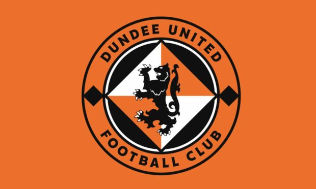
The boss of the Dundee firm that redesigned Dundee United’s club crest has spoken of his pride in his team’s work.
United presented its new badge last month, announcing it was “evolution, not revolution”.
It had a mixed reaction with some supporters praising the cleaner, more modern look while others said they couldn’t see a difference.
But the work by Creative Graffix has not gone unnoticed in footballing circles.
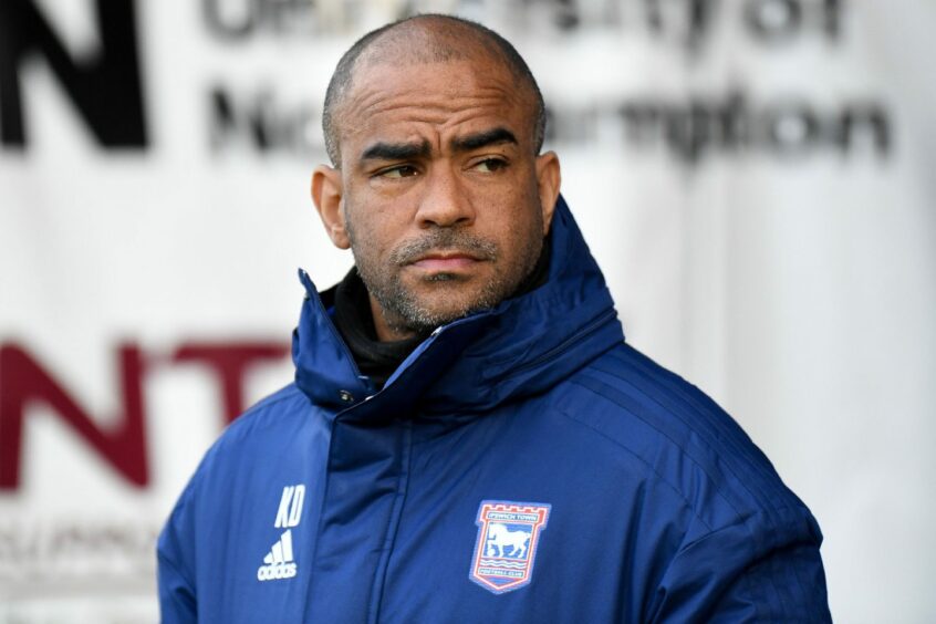
The design company has now secured a contract with Ipswich Town.
Design firm proud of DUFC work
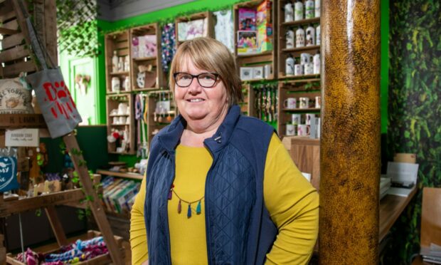
Managing director Richard Smyth is pleased with the finished result and is hoping for a long-term relationship with Dundee United.
Discussing the process, he said: “We explored lots of different avenues. The club made the choice that they didn’t want a huge difference.
“They wanted to keep the heritage of the old badge but they just wanted to modernise it.
“To a layman there’s maybe not a lot of difference but it’s been a huge amount of work.
“As they say in football circles, it has been a rollercoaster of a process, but we are proud of the work we have done with the team at Dundee United.”
What are the changes to Dundee United crest?
Mr Smyth said the initial round of work with Dundee United took more than a year.
There are several subtle differences in the new design:
- The font on the new badge has changed
- The coloured triangles behind the lion have moved 90 degrees
- The lion has been redrawn
- Everything has been aligned
“The old badge wasn’t geometric – it was probably drawn by hand at some point,” Richard adds.
“The previous font was old fashioned. We’ve streamlined the logo and now it will work well whether it’s on a mobile phone or the side of a building.
𝙀𝙫𝙤𝙡𝙪𝙩𝙞𝙤𝙣, 𝙣𝙤𝙩 𝙧𝙚𝙫𝙤𝙡𝙪𝙩𝙞𝙤𝙣…
All the changes as we unveil our new club crest 👇
— Dundee United FC (@dundeeunitedfc) June 20, 2022
“Many hours were spent redrawing the lion rampant and exploring the possibilities of how far we could push the crest in a new direction while being sensitive to the legacy of what had come before.
“The crest was one part of the work we did for United. We created brand guidelines that are 58 pages long.
“There was also much discussion about the famous tangerine colour and how we could keep that consistent across print and digital.
“Everyone’s got an opinion but I know Dundee United are very happy with the work.”
New football contract kicks off
Almost immediately after the new logo was unveiled, Creative Graffix took an enquiry from League One side Ipswich Town.
They have asked the Dundee design firm to do a similar job with their crest.
Richard explains: “It’s a rework of their crest. Again that was drawn 20 years ago by hand and when they put it on a big screen it’s a little wonky.
“Nobody will probably even realise it has been done but it’s going to be tidied up for them.
“It’s great to win the work. Who knows where this could go?”
Creative Graffix can trace its history in Dundee back to 1986 when it opened on Castle Street as part of the Kall Kwik franchise.
In 2005 the business moved to Riverside Court and in 2011 became an independent company.



Conversation